Design your first card
The Designer combines a layer list, a central canvas, and an inspector. Build the visual structure once, then connect it to data so the same layout can produce many cards.
Wait for Saved before closing the tab or switching networks. If Studio reports a conflict with a local recovery copy, compare the choices before keeping either version.
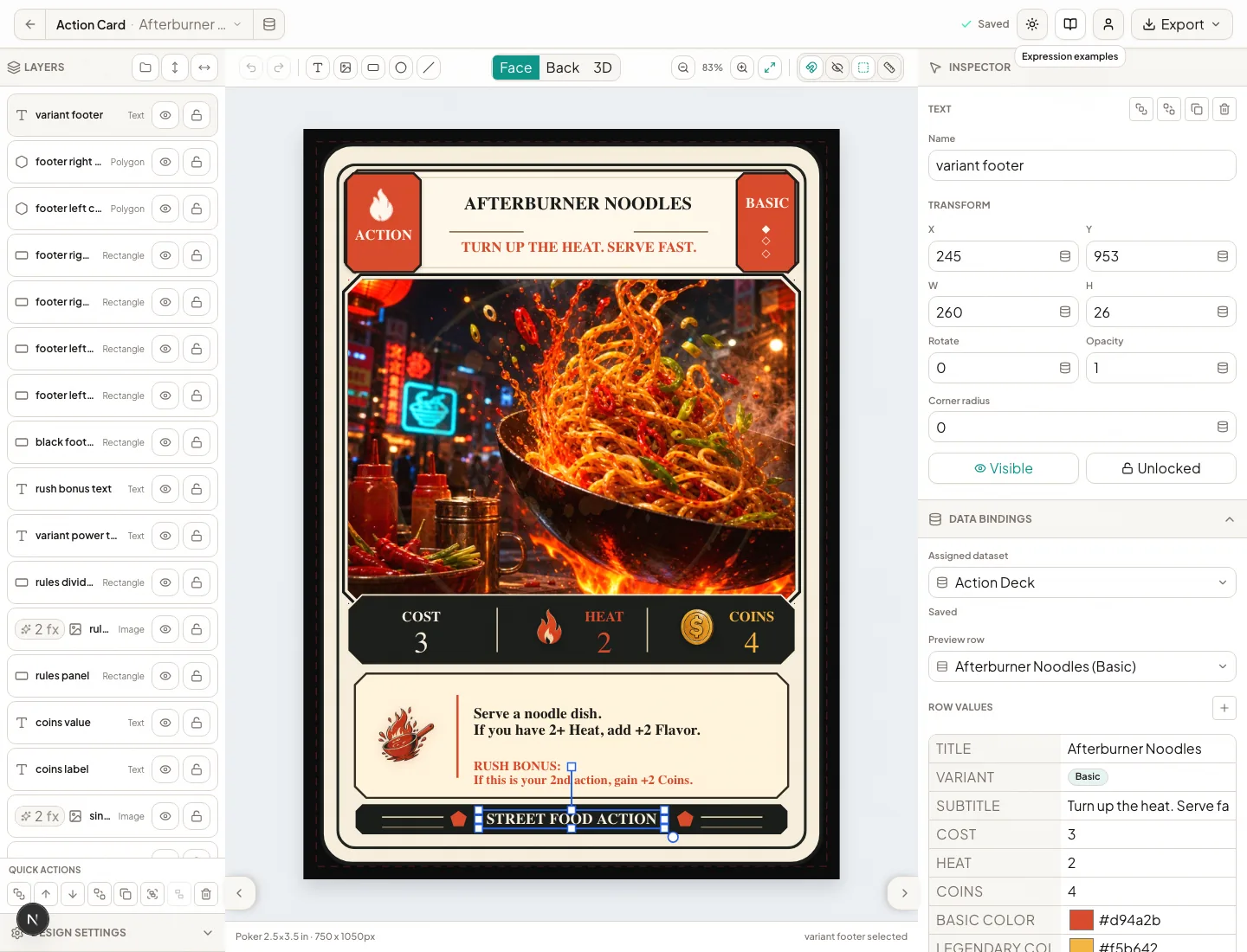 The layer list is on the left, the canvas is in the middle, and selected-layer settings appear on the right.
1. Create or open a design
From Designs, create a design and choose the physical size that matches the piece. The size controls the canvas and later print calculations; changing it late may require repositioning content.
Use Face and Back to work on each side. Project cover designs have only the side needed for the cover.
2. Add layers
The toolbar can add text, images, rectangles, ellipses, polygons, and lines. Select a layer to change its position, size, rotation, opacity, appearance, and data binding in the inspector.
Use clear layer names such as card title, main artwork, and rules panel. Good names make grouping, effects, and troubleshooting much faster than a list of repeated “Text” layers.
3. Arrange the card
- Drag on the canvas for visual placement.
- Use inspector fields when exact measurements matter.
- Group layers that should move or transform together.
- Lock background and frame layers once they are settled.
- Use guides, snapping, print margins, and canvas overlays to keep important content safe.
4. Preview real content
Assign a dataset, then bind layers to its columns. The row picker in the header changes the card shown on the canvas. Check the shortest and longest text, images with different shapes, and every enum option that creates a variant.
The 3D view is useful for presentation and quick spatial checks. Use the flat face/back preview and Export QA for precise print review.
Next: Work with layers and effects.